Showing posts with label sign. Show all posts

Taunton, Somerset

By // No comments:

Georgian Art Deco

Here is something I have little to say about – with the exception of single a observation. This Post Office in Taunton was built in 1911 in the neo-Georgian style (red brick with stone dressings on the upper floors, stone on the ground floor) then popular for Post Offices. I have noticed before how this style was popular in the early-20th century, and seemed to work well.

But look at the letterforms used on the identifying 'Post Office' sign above the door. Cut carefully into the stone, the letters look nothing if not Art Deco – those elongated letters popular on shop fronts in the 1920s. I am thinking of the Fs and Es with cross bars near the top of the letter, the enlarged bowl of the P, the slightly forward-sloping S. Is the lettering later than the rest of the building, or unusually forward-looking? I really don't know, but I like the way the two things work together – and how they made me pause and ponder as I walked along the street.

Harrogate, Yorkshire

By // No comments:

Hotel town (3)

Seasoned visitors to this blog will know about my liking for three-dimensional inn signs and for swans. These two interests have collided at several places (including Wells and Leighton Buzzard†). Here they are again in Harrogate, in the form of this beautiful 3D sign, nicely posed and modelled. I don’t know how old the sign is: it stands on a post well distanced from the facade and most ‘vintage’ images of the Old Swan Hotel in Harrogate zoom in close and miss out the sign completely.

The inn itself goes back at least to 1777, but much of the current building probably dates from a remodelling during Harrogate’s boom years in the late-19th century. This was when the hotel was upgraded as the Harrogate Hydro and fitted with Turkish baths and other luxuries. Today, as the Old Swan, it looks very spruce and more welcoming than the rearing swan on its sign which, feathers up and bill at the ready, still pleases the swan-loving bystander.

- - - - -

† This avian combination makes me wish that the village of Hanley Swan in Worcestershire had a Buzzard Inn; alas it does not.

Poole, Dorset

By // No comments:

Carter’s Cavalcade (2): Hunting the hart

‘Now we’re going to go into Halford’s,’ said Jo, leading our surprised group* into a building which was the scene of what seemed to be the last stages of a closing-down sale: the shop is one of those branches of Halford’s that is to cease trading. Diverting our gaze away from the cut-price car accessories, Jo pointed up the stairs, and this panel is what we saw.

It is the work of Tony Morris for Carter’s of Poole. The White Hart Hotel commissioned the sign in the 1960s and when the hotel closed, Halford’s took over the building. Later they moved, and took the finely drawn ceramic stag with them, displaying him in their High Street premises, where he has been delighting people buying car batteries, windscreen wiper blades, and adjustable spanners ever since. For now, though, we were taking advantage of the last chance to see this rare tiled species, staring at us (is he apprehensive, defiant, or just vigilant?) from atop his pedestal. We were assured that the Hart would remain in position when Halford’s move out. One hopes that the new tenants of the building will display this striking piece of ceramic art with pride.

- - - - -

* We were on a guided walk. See the previous post for details.

Poole, Dorset

By // No comments:

Carter’s cavalcade (1): Very Art Nouveau

I’m going to devote the next couple of posts to some of the things I saw on a visit to Poole the other day, when I went on a guided walk through the centre of the town led by Jo Amey, known online as The Tile Lady. The subject of the walk was the legacy of Carter & Co, the ceramics company that was once based in Poole and which produced a range of tiles, a number of which can be found on buildings around the town. Not all of these are in their original positions, and not all of them are easy to find, which was one reason I was very grateful to go on this walk.*

One of the tile gems we saw on the walk was this glowing panel bearing Carter’s name. It dates to around 1905 and was originally on a wall of the company’s East Quay works. When the works closed and the quayside was redeveloped, several examples of tiling from the old works were displayed on the walls of the new building: this is one of them. It’s prized for its rich reds and its beautiful lustre glazes. A lustre glaze is a metallic glaze that shines with iridescence, an effect produced by metallic oxides. Lustreware was produced in the great civilisations of early Islam, but its most famous exponent in the west was William de Morgan, who revived lustre glazes in the 1870s. The iridescent tiles in this panel were made under the influence of de Morgan, and they make a sumptuous border for the central area of the imposition, framing the company name.

The artful lettering of the Carter’s name is the other reason why I particularly like these tiles. Their expressively curvaceous lines are the essence of the Art Nouveau style, as many readers will recognise. The way the letters are full of curves and loops, the manner in which they break free of the base line, and their habit of overlapping and interlacing – all these are typical of Art Nouveau. But the most typical feature of all is the collection of multiple curves, many doubling back on themselves like waves or whips – hence the term ‘whiplash curve’, by which they’re known. Wherever there is Art Nouveau lettering of the curvaceous kind†, from the posters of Afons Mucha¶ to the early Paris Metro stations, you will find whiplash curves.

Now when I do talks and lectures I can show people instantly what architectural Art Nouveau is about. And one couldn’t wish for a more beautiful or memorable way to explain this.

- - - - -

* Another reason is Jo’s wealth of knowledge of the subject; I’d advise anyone who might want to go on one of her walks to follow her Facebook page, The Tile Lady . The page has many pictures of beautiful tiles and she posts information about the walks there too.

† The other dominant form of Art Nouveau, the style of the Secessionist movement that prevailed in Germany and Central Europe, is much more rectilinear.

¶ Also known as Alphonse Mucha. His many French posters, his long residence in Paris, and this spelling of his name lead many people to assume he was French (or perhaps Belgian). Actually he was born in Moravia, which is part of what is now the Czech Republic. 

Bampton, Oxfordshire

By // No comments:

The brewer’s art

Since doing a post, over a year ago, about a lovely ‘West Country Ales’ brewery plaque, I’ve meant to return to the subject and post at least one more of the ceramic plaques or ‘house marks’ that breweries used to identify their brand on the outsides of public houses. So here, at last, is one of my favourites, the plaque of the Morland brewery of Abingdon, although I would like to be able to share more information about it than I can.

You get the idea quickly enough: the plaque depicts an 18th-century artist with his palette, eyeing a glass of beer, with the implication that brewing is an art in itself, and you’ll find the equivalent of a masterpiece of brewing at a Morland house. But it’s a little more than that. Morland was the name of an actual artist – indeed, a family of actual artists, in the 18th century. Perhaps the most well known of them was Henry Robert Morland (c. 1716–97), a portrait painter whose most famous subject was King George III. But the image on the plaque is said to be of his son, animal painter George Morland. I don’t think the brewing family, who founded their business in 1711, was connected closely with the artistic Morlands – but I’m not sure: perhaps a reader knows.

These brightly coloured artist plaques are quite common in the area around Abingdon – this one is on a residential building, presumably a former pub, in Bampton – even now the firm no longer exists as a separate entity (it was bought by Greene King in 2000) and the brewery in Abingdon has been covered to apartments. Probably the most brightly coloured of brewery house marks, the plaques were made by Carter’s of Poole or Poole Pottery and are said to have been designed by Reginald Bell. Was this the same Reginald Bell who was part of the Clayton and Bell stained-glass firm? Again, I’d be pleased to hear if anyone knows.

The Morland brand name is still familiar to drinkers – beers such as Old Speckled Hen (and a family of other ‘Hen’-related beers and ales) are widely drunk. A few who drink these will remember various brews with artist-related names that Morland’s once produced, when they were independent exponents of the brewer’s art.

Sheffield

By // No comments:

Eye-Witness to industry

One of the things that impressed me about Sheffield was that there are still remains of its industrial past right in the centre of the city. Most visitors must be aware of this – a walk down the central Arundel Street reveals a number of former factories; some of them have been beautifully restored; all the buildings are at least in use. My walks around the city took me west of these buildings, until I came to Milton Street and found Eye-Witness Works, which, my Pevsner City Guide to Sheffield tells me, is the only traditional integrated cutlery works still in operation in the city. Except that it isn’t any more: I arrived to find notices on the doors with details of the firm’s new address. Eye-Witness works, meanwhile, bears a ‘for sale’ sign.

What one can see from the street is a long, three-storey brick building that fronts three courtyards. Looking at the brickwork, and the style and position of the windows, it’s clear that the building is actually the result of several different construction phases. The part in the foreground, with the round-topped windows at first-floor level, is from about 1852, the other parts came later, with the long range at the far end added in about 1875, when the older sections were also heightened (see the change in the colour of the brickwork). The early part of the building, at least, is not totally utilitarian – the corner has some stone dressing and there’s a Venetian window above the first cart entrance, to add a visual highlight. Mostly though, this factory is plain and businesslike and must have served its users well for decades.

The lettering however, as can be seen in my lower photograph, is barely hanging on. The paintwork has deteriorated and some of the letters have fallen off, while others are coming to pieces. They look to be wooden letters, and naturally have not proved as durable as the carved stone signs on some of the other former factories in the city. It would be wonderful if the purchasers restored this lettering, so that we are never in any doubt that this was ‘Eye-Witness Works, Cutlery and Plate Manufacturers’, the message as clear as it was at the time the sign was first erected, perhaps in the late-19th century, when it must have been as shiny as Sheffield plate.
- - -

* I have a feeling there may be one or two more Sheffield posts coming up.

Gloucester Road, London

By // No comments:

On the tracks of old railways (2): Mosaic

The London underground network developed and grew long before Leslie Green designed his distinctive tiled stations for London (see my previous post). The first line opened in 1863, and by 1868, this station was built on Gloucester Road to accommodate lines run by the Metropolitan Railway and the District Railway (later the word ‘Line’ replaced ‘Railway’ in the names). This part of the station, on Gloucester Road itself, has a Classical facade of cream coloured brickwork topped with ball finials and stone urns.

What sets off this frontage, though, is the large and excellent sign, just beneath the cornice. I suppose nowadays few people look at it. Their eyes are drawn to the signage down at pavement level, which clearly identifies the building as an underground station. But when I’m passing, I always look up and admire the effort that went into this sign: its pleasant lettering (with rather a top-heavy ‘R’ but a lovely extra curly ampersand) and its pale green mosaic, the green tiles varied enough in hue to give the background some interest. It’s worth anyone’s glance.

The photograph of the whole facade, above, is by A. Brady; the one of the mosaic sign, at the top of the post, is by me.

Highley, Worcestershire

By // No comments:

The signs of yesteryear

In the words of Chard Whitlow, Henry Reed’s amusing parody of T. S. Eliot, ‘As we get older we do not get any younger’. As I get older, I can’t say I experience outright rudeness that often, although the world is not short of oafish behaviour, as a swift walk through any provincial town on a Friday night will reveal. I wonder, though, whether in days gone by it wasn’t worse. One certainly might think so, looking at old notices aimed at improving people’s behaviour. You didn’t have to go far before encountering a ‘COMMIT NO NUISANCE’ (low down, where an inconvenienced ‘gentleman’ might ‘aim’), an ‘ANYONE SMOKING WILL BE PROSECUTED’ (more likely at eye level), a ‘PLEASE REFRAIN FROM SPITTING’ (on buses), a ‘GENTLEMEN RAISE THE SEAT’¶ (on trains), or even an ‘ANY PERSON WILFULLY INJURING ANY PART OF THIS BRIDGE WILL BE GUILTY OF FELONY AND UPON CONVICTION LIABLE TO BE TRANSPORTED FOR LIFE’ (on bridges, in Dorset).

Oh, the signs of yesteryear. So people really had to be told not to spit on the bus or piddle in the corner? I suppose they did, oafs being as thick on the ground then as now, and hygiene being as important then as ever. So the Victorians and Edwardians got on and told them, in bold painted notices and cast-iron signs. Maybe some people even took notice of the notices. But above all, I suppose, it’s the language that marks them out, with its bracing mixture of euphemism (‘nuisance’) and dire warning (‘transported for life’).

A sign of the euphemistic sort that I’d never seen was ‘PLEASE ADJUST YOUR DRESS BEFORE LEAVING’. How can I have missed that one? Too busy admiring the plumbing in the Gents? I don’t know. I became aware of the existence of such signs years ago, reading an excellent book, The Faber Book of Parodies.* This contains not only the poem quoted at the beginning of this post, but a further go at T. S. Eliot, a sort of synoptic parody, called Sweeney in Articulo, attributed to Myra Buttle.† One section of this mock-epic concludes with a random-seeming bunch of quotations, in allusion to the allusive way in which Eliot’s The Waste Land ends. There’s one from Baudelaire, a bit of Latin, some Chinese characters, and then, mixing the highfalutin with the lowly:

‘Love thy neighbour as thyself,’
‘Couldn’t you bring better weather with you?’ and,
Above all,
‘Please adjust your dress before leaving.’

Like anything about T S Eliot, the poem has to have footnotes, and the final line is glossed, ‘Reproduced by permission of Westminster City Council’.

I was thrilled, therefore, some forty years on from reading the parody, to visit the railway station at Highley on the Severn Valley Railway§ and find, not only a ‘Paisley’ water cistern by Doulton and Co, looking like a large butler’s sink painted black, held above my head on two very sturdy iron brackets, but also this notice, a cast-iron plate with letters picked out in white on a black background. Thank you to the Severn Valley Railway for paying attention to the small things. As one must do when adjusting one’s dress before leaving…

- - - - -

¶ Jonathan Miller, in Beyond the Fringe, offered the suggestion that this might be a loyal toast.

* Dwight MacDonald (ed), The Faber Book of Parodies (Faber and Faber, 1961)

† After wondering for a minute whether ‘Myra Buttle’ might be a pseudonym of one of my Oxford tutors, Marilyn Butler, I read that Myra Buttle was a Cambridge don, a Sinologist called Victor Purcell. Anyone who likes parodies might also want to search out Myra Buttle, The Sweeniad (Secker & Warburg, 1958), which contains the Sweeney epic. 

§ Like many preserved railway lines, the Severn Valley is a good hunting-ground for sign-fanciers: it has an abundance of old enamel advertising signs.

Lincoln

By // No comments:

Squared up

To complete my trio of posts from Lincoln, here’s a couple of street name signs that caught my eye. I can’t say I like them quite as much as the strong and characterful Egyptian letters that I’ve always admired in Louth, my favourite Lincolnshire market town, northeast of Lincoln itself on the way to the coast. The Louth signs have everything going for them, it seems to me – clarity, distinctiveness, a style that works well across the varied town centre, a coherent overall shape.

These Lincoln signs, by contrast, have letters which seem rather constricted. This is particularly true of some of the rounded letters, the S especially, which looks as if it has been squashed so that it has flattened at the top and bottom. The same effect appears on the O, although the curve of the U has a more rounded form. However, the signs are clear, and the even effect when the letters are set quite close together. as in ’St Swithins Square’ is elegant. The border, formed like a picture frame, is effective too, and unusual in my experience.*

The more I look at these signs, the more I like them. And they are wearing well, although the left-hand one could perhaps do with a bit of rubbing down and painting up. I’d much rather have these than the flat, plastic signboards that are now so common in many places. I hope Lincoln hangs on to them.

- - - - -

* I’m having fun, by the way, trying to guess what was painted on the wall before the signs were fitted. The ghostly letter that’s just visible does not seem to be of the current street name.

Cheltenham, Gloucestershire

By // No comments:

The photographer and the sweep

One person I remember from my childhood in Cheltenham (a time that came back to me forcefully when I recently visited The Wilson in the town and came face to face with the figure in my previous post) was a photographer called Eric Franks. Eric, who was a neighbour of a relative of mine, worked for a publisher of guidebooks, Burrow, who were based in Cheltenham; they presumably sent him round to the various places they were covering in their books to photograph old buildings, picturesque high streets, and atmospheric views. Although colour photography was well established by the time I knew him, colour printing was still costly, and most of his work was in black and white.

Eric Franks didn’t put away his camera when he left work. He was always taking photographs, and built up a large archive of images of Cheltenham between the late 1930s and the 1950s. He was still at it when I came across him in the 1960s and 1970s, but those earlier images especially constitute a unique pictorial record of a very special provincial town before it changed radically with 1960s redevelopment and ‘improvement’. Eric Franks’ book, Images of Cheltenham, shows how good he was. It’s full of evocative scenes – not just architecture, but people, caught going about their everyday lives – children hurrying to school, codgers gossiping on street corners, shoppers, the Spa Harp Trio playing by the roadside. The handling of light in all the images is outstanding.*
One of the photographs shows the most extraordinary trade sign I’ve ever seen: the sooty black figure of a chimney sweep mounted high up on a wall, casting a cold and somewhat sinister eye on the passers-by below.  This figure had vanished from its original home in Cheltenham’s Sherborne Street by the time I was growing up, but what I’d not realised was that it found a home in The Wilson, again mounted high up so that visitors can see it as they would have done when it was above the sweep’s door. 

Its metal construction is clear from the jagged edge of the sweep’s coat and the way the material – zinc – has been rather crudely worked to represent the way the material of the coat bunches above the waist. If the jagged edge of the garment is worn with age, that’s understandable. The museum believes the sign to date to about 1830 and it was only removed from its original perch in 1950,§ when the last chimney sweep of Sherborne Street hung up his brushes and rods and retired. The last sweep was called Frederick Field, and when he retired he was 79 years old and was said to be the oldest working chimney sweep in Britain. He was apparently often seen around the town transporting bags of soot on the handlebars of his bicycle. Previous Sherborne Street sweeps used a small cart, drawn by a succession of beasts including at various times a donkey and a Shetland pony.

Looking down on us like this, the figure has a rather spooky gaze.† How unlike the appreciative and perceptive eye of Eric Franks, whose photographs shed a benevolent light on the streets and the people of the town he loved.

- - - - -

* Eric Franks is remembered in the name of one of the prizes given at the Cheltenham Camera Club; his book, Images of Cheltenham, is well worth seeking out. The photograph of the book’s cover I have used is taken from the internet, as I seem to have mislaid my own copy: I hope it turns up and if it does I intend to replace the photograph with one more worthy of its creator.

§ I'm told the figure was displayed on a house on the other side of street for some years after this.

† As the figure in the museum was well lit, but not ideally so for photography, the face in my picture is rather dark, but not inappropriately so, I think. ‘What we need is some snooted light on the face,’ as a photographer colleague of mine used to say.

Cheltenham, Gloucestershire

By // No comments:

Happy New Year!

This figure of a Scotsman in Highland dress taking snuff is a memory from my childhood. Growing up in Cheltenham, I regularly saw it outside Frederick Wright’s tobacconist’s shop in the town’s High Street. He is taking snuff – snuff from Scotland being famous – and guiding people towards his owner’s door. He’s now in the town’s museum (known as The Wilson these days), and is one of several extraordinary shop signs be seen there.

Highlander figures were well known as tobacconists’ shop signs by the time of the 1745 rebellion, as after this date highland dress was banned and tobacconists sought to confirm that they could continue to exhibit these figures outside their shops without being accused of breaking the law or of a lack of loyalty to the Hanoverian monarchy. The figures, usually made of wood, were still common the Victorian period, but relatively few survived into the 20th century.

This particular example was a well known landmark in the town and Wright’s address on the accompanying enamel advertising sign is given as ‘The Old Scotchman, 122 High Street, Cheltenham’, in the style of former years equating the building with its sign, to help those who could not read, and those others who could read but could not remember names and numbers. Find the Old Scotchman* and you can’t go wrong.

The Resident Wise Woman and I were pleased to have this reminder of times gone by when we made a post-Christmas visit to The Wilson. We were also pleased to be able to introduce our son to the figure. He too was charmed by it, no less so because of its unrealistic ultra-skinny proportions. More porridge required, clearly, in these chilly times.

- - - - -

*We now regard ‘Scotchman’ as a solecism: ‘Scotch whisky’ is OK, unless you’re in Scotland itself, when it’s just whisky; but a man from Scotland is a Scotsman. But ‘Scotch’ to mean ‘Scottish’ when applied to people not whisky has a long history, as any reader of Lord Byron’s 1809 poem English Bards and Scotch Reviewers will know.

St John's Wood, London

By // No comments:

Specific gravity

My photograph shows a representative selection of the architecture of St John’s Wood High Street. In the left background are classical blocks, probably of the 1830s or soon after, of white or yellow brick with stucco details. Then, a bit closer, a red brick and white ‘Queen Anne’ group with the fancy curvy gables and the characteristic square-pane glazing of the late-19th century. There’s a lot of  late-19th century stripy masonry round here, as witness the building in the right foreground, a bank, more classical but still in a contrasting mix of materials, here brick and Portland stone.

In the middle of it all is the pub, the Sir Isaac Newton, standing out like a flashing beacon. This is another late-19th century building (1892, says Pevsner), this time in red brick and orangey terracotta, a combination of colours that means that the bands are there but don’t provide much contrast. Instead, the whole building glows. Like its neighbour, it has ornate gables.
The other stand-out feature is the integral sign on the side wall. This is bordered by rich foliate architectural ornament and within this border is some outré Art Nouveau lettering of the kind that people rejoiced in during the period 1890–1910. It’s a confection of bifurcated strokes, over-the-top spiralling curves (especially the S and C), curious concavities (the N, E and A), and sheer eccentricity (the W). If we associate Sir Isaac Newton with gravity, this intoxicated lettering hardly embodies that characteristic. Perhaps another kind of gravity, specific gravity, comes to mind. Cheers!

Salisbury, Wiltshire

By // No comments:

On high

When in Salisbury I always look up at the sign of the White Hart Hotel, a particularly lovely three-dimensional inn sign that stands out against the sky. The building it crowns is a large inn of about 1820 with an enormous Doric portico, but there has actually been an inn here since at least 1635. The use of the white hart as a badge goes back further still – it was the device of King Richard II and that fact accounts for the crown around the creature’s neck.

On this sign the crown and chain look as they have been made of metal and attached to the figure of the hart. The fact that the antlers are a different colour makes them stand out too, as if the sculptor had used a real pair of antlers. although this is no doubt the effect of a paint job.*

From ground level, everything is less distinct than in my photograph, which was taken with a zoom lens at full extension. Most passers-by are therefore unaware of the details of the sign. More often than not in my experience, the creature appears in silhouette, in which form he is still an effective marker, enabling one to single out the building from some distance away and forming a bold effect for an imposing building.

- - - -

*I'm not sure of the material used for the hart itself. The rough surface looks stone-like, but this may be the effect of a coat or two of masonry paint, plus grime. Could it be Coade stone?

Abingdon, Berkshire*

By // No comments:

Entirely satisfactory

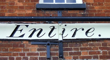
Looking for something else in my file of photographs, I came across a couple I took years ago of the Old Anchor pub in Abingon. They reminded me that I must go back and take better pictures, but meanwhile I can’t resist sharing them. The building may have a 17th-century heart (there is some timber-framed construction around the back) hidden by this 19th-century red-brick front. The carved lettering, carefully filled in with black paint, stands out beautifully from the brickwork. It probably dates to 1884, when the pub’s licence was first taken out. The lettering of the pub name is a sans serif (or ‘grotesque’) form with plenty of clarity. Apart from the very short middle stroke to the E it’s unremarkable but very effective.
The italic letters making up the words ‘Morland’s’ and ‘Entire’ on either side are much more distinctive. Looking closely one can see the bevelled cut made into the stone and the delicate way in which the transition between the thick main strokes and the very thin strokes and serifs in handled. Looking on my shelves, I see that this lettering was noticed by designer and writer on letterforms Alan Bartram – he illustrates it in his book The English Lettering Tradition from 1700 to the Present Day. He points out that the source of these italics is in the traditional English letter,§ giving the characters their rich forms and ‘generous curves’. Bartram adds that contemporary ‘modern’ printing type may have influenced the strong contrast between thick and thin strokes.

Then there’s the wording: ‘Morland’s Entire’. When I saw that, I wondered if it was referring to a specific type of beer, or an indication that only this particular brewery’s beer was served here. Wrong. A friend sent me to Chamber’s Dictionary, which gives ‘Entire, noun. Porter or stout as delivered from the brewery.’ I’m not sure you could get that here now, but it seems that they still have Morland’s beer in the bar. They also play Aunt Sally† in the garden. English pubs are full of surprises.

- - - - -

* It’s in Oxfordshire nowadays, but I persist in using the old English counties and boundaries, for reasons I’ve gone into before, namely my sentimental liking for the old counties, my interest in their history, and the fact that they are also used in reference books such as Pevsner’s Buildings of England series.

§ Which he characterises as a ‘seriffed, varied-weight (stressed) letter’ with ‘a rich full shape, a vertical stress, and a fairly sharp gradation from thick to thin strokes’.

† A game in which sticks or battens are thrown at a wooden figure, traditionally a model of an old woman. The website of the Abingdon and District Aunt Sally Association (‘You know it’s good when you hear the wood’) is here.